
Basic essential css tricks
All HTML elements can be considered as boxes. In CSS, the term "box model" is used when talking about design and layout.
-
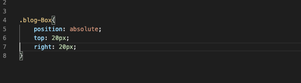
Absolute position
If you want authority over where a component lives on our site consistently, absolute positioning is the way to getting this going. If you want your browser as one big boundary box, absolute positioning permits you to control precisely where in that container a component will remain. Utilize top, right, bottom and left, joined by a pixel value to control where a component remains.
-
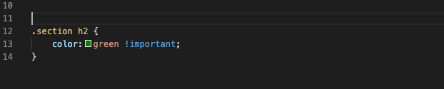
Overriding all styles
This should be utilized ina. infrequently, in such a case that you do this for everything, you're going to get stuck up in a tough situation in the end. In any case, in the component that you need to override another CSS style for a particular component, use !important after the style in your css.For eg: if you wanted the H2 headers in a specific section of a component to be Green instead of blue, I would be use the following CSS:
-
Centering
Centering is sensitive, because it relies upon what you're attempting to center. CSS of things to be centered, based on substance.
-
Text
You can center the text by using text-align:center; and if you want it on others side, use left or right instead of center
-
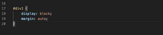
Content
With block property a div or any element can be centered and then using margin as auto. It would look like this
-
Hover Effect
Hover effect is used on buttons, icons, text, links and more. If you want something to change the colour according to you when someone just places his mouse on it use the same CSS just add hover: and change the styling.
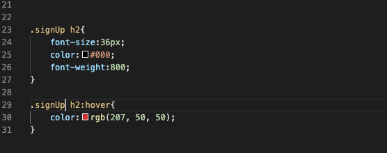
What it does is that it will change the colour of your h2 tag from dark to red when somebody drifts the mouse on it. The incredible thing about utilizing :hover is that you don't need to announce the new font-size or weight once more. It just changes what you determine.
-
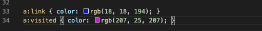
Link States
These styles are missed by a lot of programers, and it truly causes ease of use issues with your client. The :link pseudo-class controls all connections that haven't been tapped on yet. The ":visited" pseudo class handles the styling of the entirety of the links you've just visited. This tells site user where they have just been on your site, and where they haven't explored yet
-
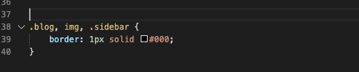
Apply CSS to Multiple Classes or Selectors
Let’s assume you need to apply an identical border around all images , sidebar and the blog section. So, in this case you don't need to write the exact same CSS multiple times. Just list them and separate them by commas like :
Whether you've been programming for quite a long time, or you're simply beginning, figuring out how to build sites the correct way When you've limited which language you have learnt, you need to learn and refine your skills.
Regardless of what you learn, CSS is one of those basic, yet overwhelming skills you need to ace. It doesn't need to be so hard, particularly on the off chance that you know a couple of helpful and lesser-known CSS procedures to take care of.
-
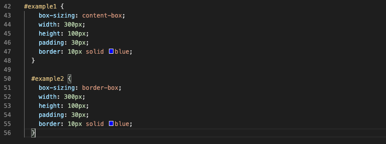
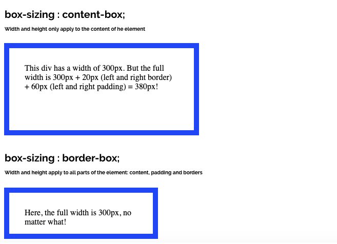
box-sizing: border-box;
This can be explained as box-sizing property considering how the width and height of a component is calculated, should they include paddings and border , or not. In this when you set the specific height and width to the box and add padding to it, the padding is added to the size of the box, with box-sizing: border-box box stays the same which they meant to be
-
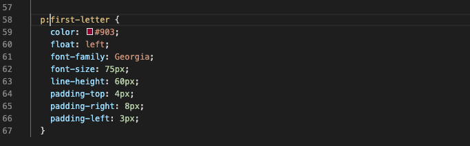
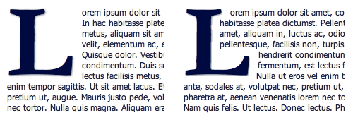
Drop Caps
Everybody loves drop tops. It helps us to remember the customary printed book, and is an extraordinary method to begin a page of substance. That first, enormous letter truly catches your eye. There's a simple method to make a drop cap in css, and it's by utilizing the pseudo component: :first letter. example :
-
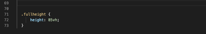
Vertical Screen Height
Some of the time you need a segment to fill the whole screen, regardless of what the screen size is. You can control this with vh, or see height. The number before it is a percentage, so on the off chance that you need it to fill 100% of the screen, you would set it to 100. You may set it to a value like 85% to get a fixed route menu.
Make a class for the div or container and apply the vh you need it to have. One thing you may need to change is the media query for explicit screens or directions like telephones in portrait mode. Imagine a landscape image is stretching to fit into a portrait mode, this won’t look good.
Conclusion
These are some basic essential CSS tricks which you can use and If you're a beginner and have basic knowledge how a model works and box layout . So these are occasional dirty hack , that will help you to build the design.
0 Comments:
Leave a Comments